Visual identity refresh for diego5, a video production company undergoing structural and generational change.
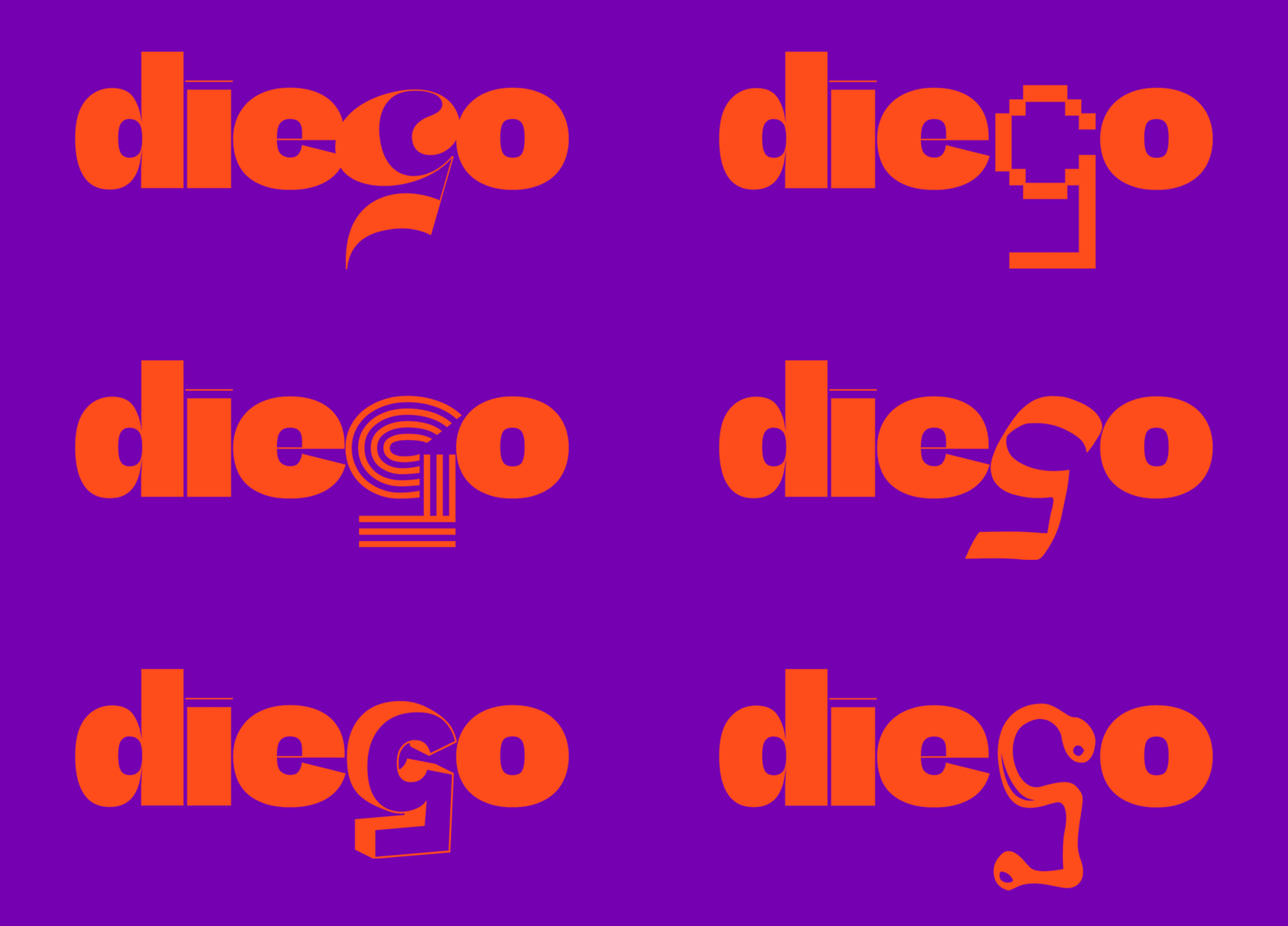
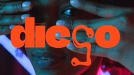
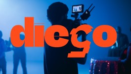
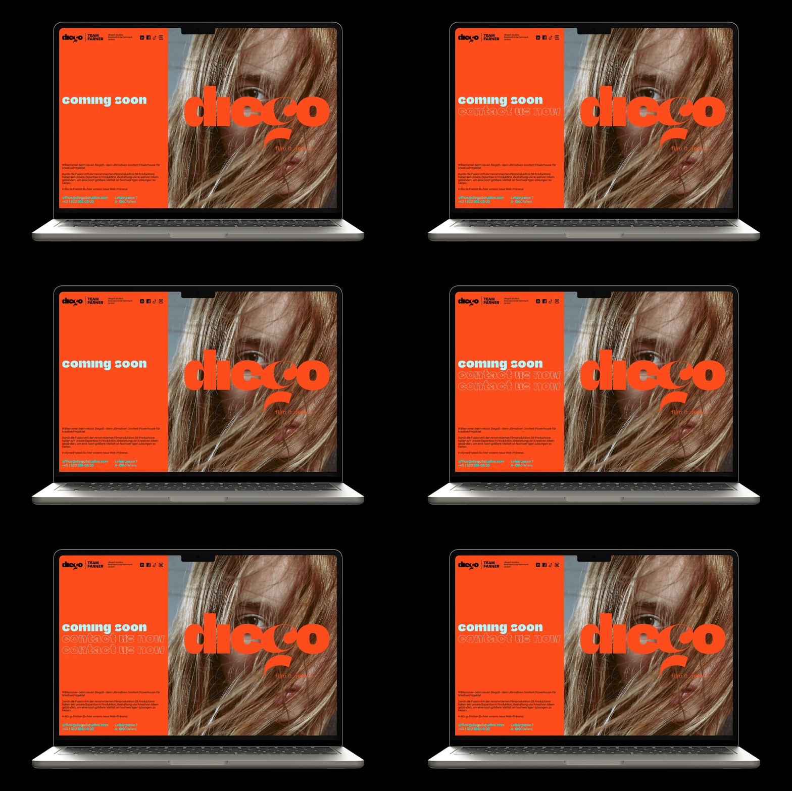
The new logo responds to a younger team and an evolved understanding of the company’s work. An inverted “5” was developed as the core graphic element — each variation representing one of the company’s seven service areas.
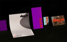
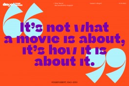
The identity was complemented by a refreshed colour palette, a new image guideline to structure visual output, and updated stationery.
The result is a flexible visual framework that reflects diego5’s expanded scope while remaining clear and recognisable.
Agency: KTHE I Team Farner
